There are numerous challenges when designing a webshop, especially if you are a beginner like me. In trying to learn and understand what works best, every little thing can become an obstacle. However, I’ve learned that all the small details are important and can have a significant impact on creating an intuitive and smooth user experience.
As designers, we want to create an intuitive product without friction in the flow and cognitive overload. This means we need to design a familiar experience that aligns with the mental model of users, which is based on the physical world and other websites they use in their everyday life. Therefore, online shopping should remind us of shopping in a physical store that looks like this:
- Customer enters the store
- They search for products
- They put products in the cart
- They review the chosen products and rethink
- The customer buys the products
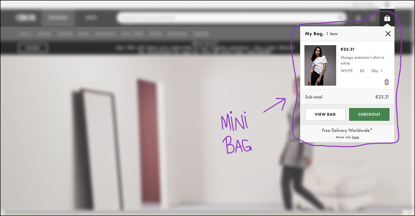
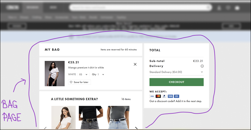
In the context of online shopping, the last three steps of the real-world shopping happen through the shopping cart/bag/basket. It is a place where you put your products, review them, and from where you proceed to payment. The experience of a shopping cart can be divided into three parts:
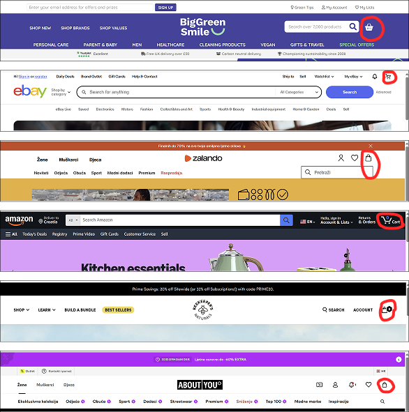
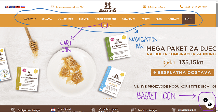
- Cart/bag/basket icon
- Mini cart/bag/basket
- Cart/bag/basket page
For example, let’s look at ASOS:
It is important to note that these three parts form a desktop pattern, whereas a mini cart is usually not found on mobile. In this article, I will focus on desktop interfaces, although much of what I write about also applies to the mobile interface.
Each of these three parts is important, and I could write about each one of them separately. But this time I will discuss only one of them. I will share what I’ve learned about one little detail in creating a webshop – a shopping cart icon. Or a bag icon. Maybe a basket icon?
4 things I learned about the shopping cart icon
Icons are important because they guide users while saving space and users’ time. They make a user interface look clean and simple. Also, they are universally recognized and communicate actions and functionalities instantly. Therefore, seeing a cart icon should immediately indicate to a user that they have entered an e-commerce site.
In trying to understand the best way to design a shopping cart icon for my project, I learned four things about a cart icon:
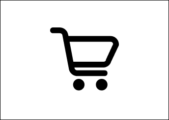
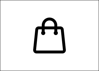
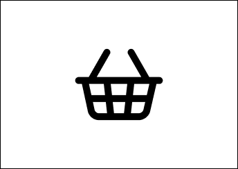
1. There are three types of the same icon: a cart, a basket, and a bag
Since I was about to design a webshop selling homemade honey and bee products for the Croatian market, I went through different sites – from the most used ones in the world selling all kinds of products to the ones selling honey, food, bio cosmetics, and similar items. Additionally, I went through the same types of webshops on the Croatian market. In total, I went through 55 e-commerce sites.
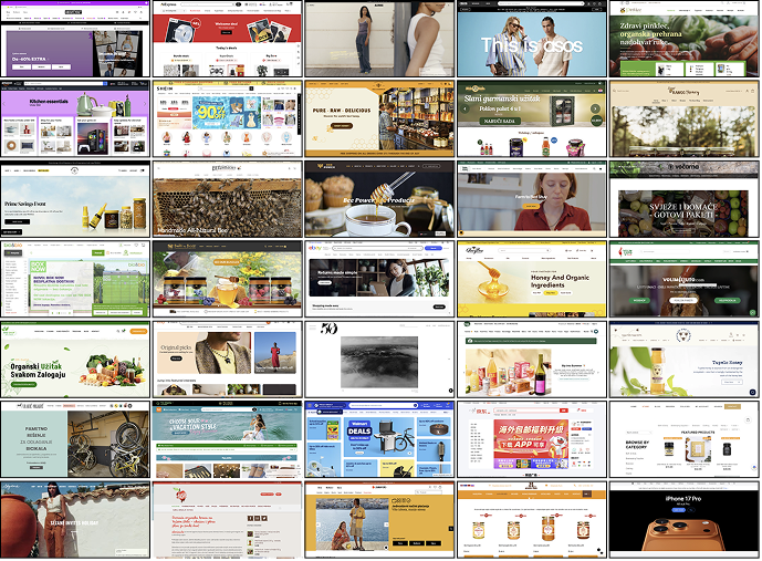
I realised that there are three types of icons: a cart, a bag, and a basket icon. Each of them was more common for different kinds of websites. This was something I was unaware of as a customer.
The most used amongst them was the cart icon – 32 out of 55. The second one was a bag appearing 11 times, and a basket icon was the rarest, with 7 examples out of 55. There were 4 examples of a bag icon that kind of looked like a basket because they were wider than a regular bag, so I didn’t put them in either a bag or a basket category. Also, Zara’s webstore didn’t have a visual icon at all, but a phrase “shopping cart” in the upper right corner where these icons are usually placed.
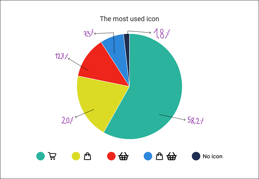
The type of the cart icon usually depends on the nature of a webshop:
- I noticed that the cart icon is mainly found on sites that sell a variety of products or for bigger purchases, such as Amazon, eBay, Temu, AliExpress, etc.
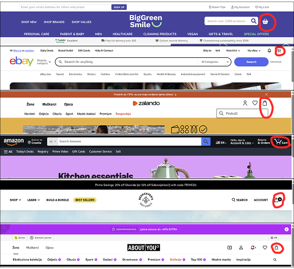
- The bag icon is more common in fashion and clothing sites such as Zalando, Asos, ABOUT YOU, and others.
- The basket icon is sometimes used for groceries or specialized food products such as honey or jam.
- Also, the ambiguous bag icons that could be seen as a basket icon were used for specialized food and organic products.
These conclusions align with the industry’s standards. The cart is the most common icon and is used by big sites that sell a wide range of products. The bag is used for clothes or expensive items such as Apple products.The basket is the least used icon, and it is for food related websites. Going back to the previously mentioned mental model, this makes sense since people use carts for buying larger items or weekly groceries, a basket for a few products, and a bag for clothes or expensive items like gadgets or jewelry. Also, these icons are used in both desktop and mobile interfaces, and there are no differences there.
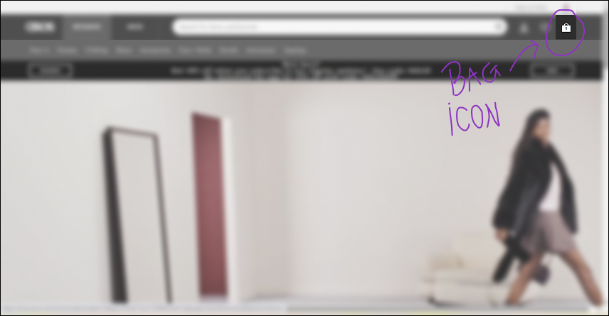
2. Position of the icon should be on the right side of the navigation bar
The most common position of the cart icon in the desktop interface is the upper-right corner, or in other words, on the right side of the navigation bar. This navigation bar is almost always at the top of the page in desktop versions, whereas in mobile versions, it is sometimes placed at the bottom.
This makes sense when we take into account the F-shaped reading pattern for the web content. According to this NNgroup study, users first read in horizontal movement, usually across the upper part of a page, then do a second horizontal movement, and in the end, they scan the page vertically. This means one of the first things they’ll see is going to be a navigation bar and their shopping cart icon that “saves” their products for purchase. It looks like a real-world scenario where a customer enters a shop, sees a cart or a basket, and starts their shopping adventure.
Out of 55 e-commerce pages I analysed, 53 had the cart icon placed at the right side of the navigation bar at the top of the page.
There was one example of this icon as a basket in the bottom right corner outside of the navigation bar, which was placed at the top of the page. This page also had another really small cart icon in the middle of the navigation bar, which could seem a bit confusing.
Also, another example of a different icon positioning was at the upper-right, but outside the navigation bar that was above the icon.
As Jakob’s law tells us, most users spend most of their time using other apps and webpages and, therefore, expect a similar experience and flow when stumbling upon yours. This means that if people are accustomed to seeing the cart icon in a certain position, we should also place it there. We don’t want our customers to be confused, anxious, or bothered by the unexpected positioning of the icon cart and waste time looking for it.
3. Sometimes the icon’s appearance doesn’t match the name for it on the button or a page
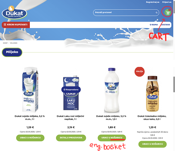
There were 60% of cases whose icon matched the word on their CTA, meaning if a webstore used a cart icon, their CTA said: “add to cart”. This leaves us with 40% of examples that used one type of icon and another word for it on the CTA or page.
For instance, there were a few webshops that used a bag icon and called it “a basket” on their page or CTA. This could be simply because they look similar.
Some pages had a bag or a basket icon, but used the word “cart” when referring to it. The reason for this could be that people are used to seeing the word “cart” just like they are used to seeing the icon.
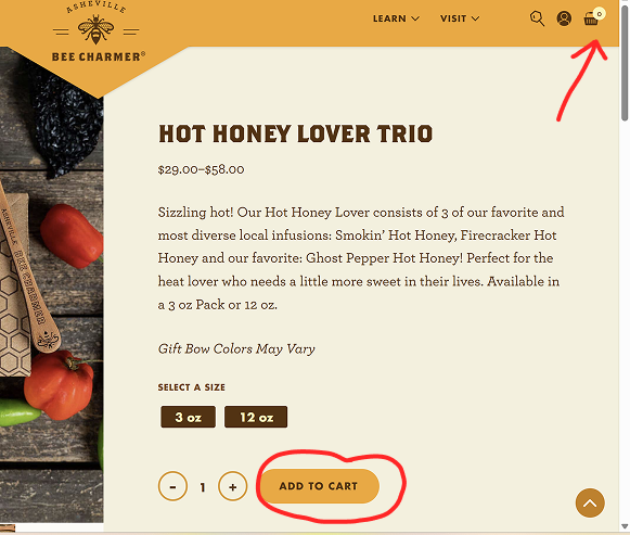
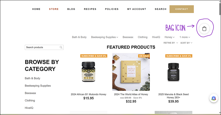
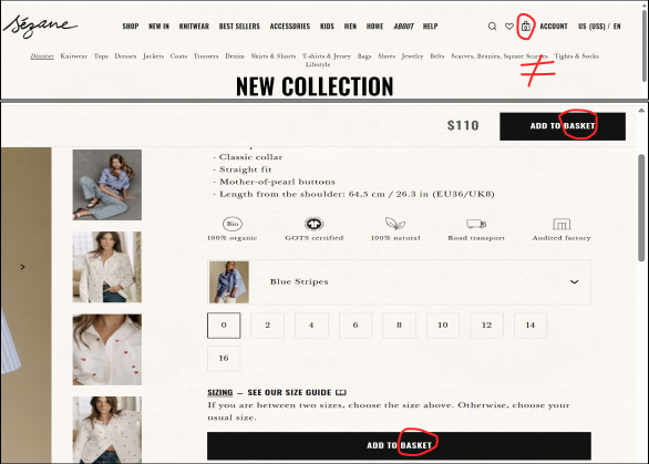
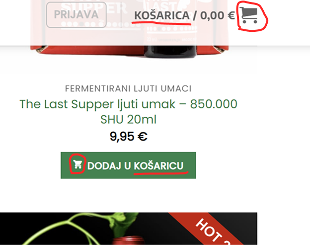
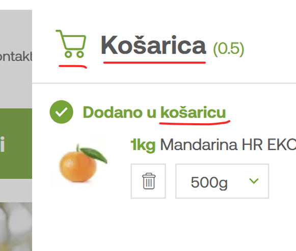
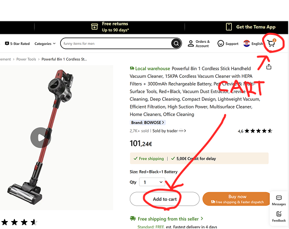
However, the most used icon was the cart icon combined with an “add to bag” or “add to basket” CTA. You can see this in the image below with the Croatian word “košarica” for basket.
I assume that some designers choose to display the cart icon because it is the most popular one, but when referring to it, they don’t use the word “cart”. Instead, they call it a “bag” or a “basket”. This example was most common among non-English websites.
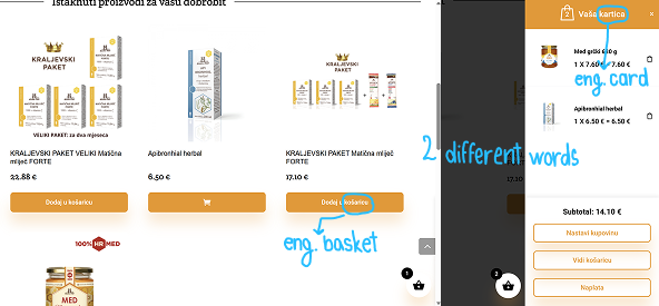
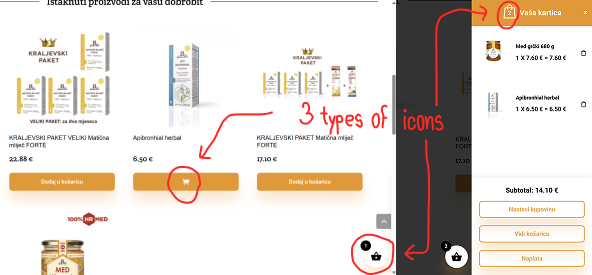
All these examples show inconsistency in design, but I think this is fine as long as we have an explanation for it. Some target groups are used to seeing one type of icon, but refer to it as something else because of their cultural background or language. However, we need to be careful here not to end up with a confusing user experience design like the example below.
This next example shows a webshop using 3 different icons: a basket at the bottom, a bag in a mini bag window, and a cart that shows up when you hover over CTA. Moreover, it uses the 2 different Croatian words “košarica” meaning “basket” on the CTA and “kartica” meaning “card” as the name of the mini cart/bag/basket. So, are your items in the basket or cart, or bag? Or are they in the “card”?
4. There are differences in cultures when referring to shopping carts
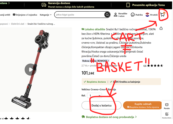
Webshops that didn’t match the icon’s appearance and name were often non-English sites from countries like Germany, Croatia, etc. Croatian sites usually use the shopping cart icon, and sometimes the bag or the basket icon, but the word they use when referring to an icon or its page is always, without exception – a basket (Croatian “košarica”). Their CTAs have an “add to basket” label, the title for the cart page is “your basket,” and so on.
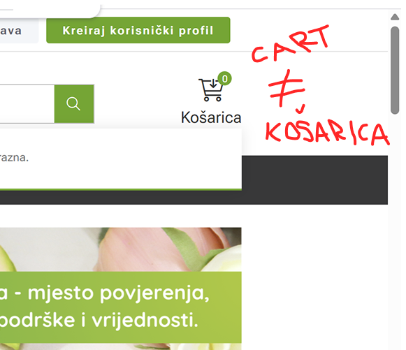
Also, when changing a site from the English version (e.g., Temu) with the “add to cart” button to the Croatian one, it would change to the “add to basket” button.
When looking at world languages, cultural differences are of great importance, and that is why we should use whichever term works best for each country and culture. Designers will use the cart icon because it is the one people see the most, but the word they’ll use will be the one that’s the most heard and seen in the language of the webshop they are creating.
Nevertheless, I think that we should aim for consistency as long as it makes sense for a certain target group. So, if I can use the same look and the word for the icon, I would do it. This would reduce friction in the flow and potential confusion.
However, as soon as the word I would use didn’t make sense for the culture I’m designing for, and the icon’s look should be different based on research and users’ needs, I would, without hesitation, make them non-identical. For instance, I wouldn’t use “add to cart” CTA in Croatian without some serious proof of its functionality, because it is very uncommon to see this phrasing in the Croatian online shopping space.
After doing this research, now I can no longer unsee the discrepancy in the icon and the word used in Croatian websites. Nobody else will never probably notice this, but now I’ll be haunted by the fact that I noticed it 😀
Conclusion
In the end, we need to understand the nature of the webshop we are designing. If you walk away with anything from this article, it should be the following:
- A cart is the most common and safest option, a bag is for clothes and luxury, and a basket is for food. Be familiar with the industry’s standards.
- Keeping the icon’s look and its name the same is good. Look for the possible options, aim for consistency.
- Ignore rules 1 and 2 if it doesn’t work with a specific local market and users’ expectations. Research the user’s needs and habits connected to a certain kind of online store, especially if they come from a different cultural and language background.
- Place the icon in the top right corner of the navigation bar.
- Always pick the best solution for each case separately. 😊